Thursday, February 24, 2011

In Print in AWW


The view of the garden inspired the formal living room - all soft blues and greens.
Anna says you can make more of a statement in a formal dining room as it is used less often.
This large outdoor covered space is a great idea for warm climate living.
Sharnel's office is creative and girly, I just love it!
The guest bathroom is very elegant.
Sharnel's daughter Olivia has a room fit for a princess.

I am very excited that another of the houses I photographed in Queensland is in print this month in the Womens Weekly. The talented Sharnel Dollar built her dream house on acreage just outside Brisbane and decorated it with the help of fabulous designer Anna Spiro.
It is such a stunning house it would almost need a book to show all the rooms and decorating ideas. As usual, these are some of the shots that didn't make the story.
Sharnel is one lucky girl...

Wednesday, February 23, 2011

Colour Clash


Clashing colour combinations have always been a favourite of mine. Thinking about doing up the second bedroom at one of the beach cottages, I can't get past blue and green (which should never be seen). Pink and orange or red and pink would have t be my most loved combination.
Most interior designers stick to the correct combos in colour theory (more or less)- like red and green, yellow and purple or blue, or orange and blue.
What is your fav combination?

Sunday, February 13, 2011

Chair Obsession


My husband says I have a thing for chairs. My bounty from a day out at garage sales or op shops will usually include at least one chair (or maybe three!).

These things I have photographed are a few of the vintage items I am currently doing up for various projects. The bentwood is for the Sydney house, the orange cane chair is for the beach cottages. It is part of a bedroom set I found last week - that's the bedhead behind.

The gypsy table is a classic. You don't see them much these days but they look great in beach houses and are so practical. I don't know whether to leave it as it is or paint it... What do you think?

Wednesday, February 9, 2011

Beach Cottage Decor, Revisited!


Inspiration shot: Bed of Flowers
Before shot: Cottage 3
Inspiration shot: Cottage 3
Before shot: Exterior Cottage 3
More Recent shot: Cottage 3

It has been a busy summer season out at the beach cottages. We have had visitors from as far away as Scotland and Singapore! Now I am determined to get back in there and do another layer of decorating as some rooms are still a little spartan.

These photos were taken of Cottage 3 early on. The bedroom with the 4-poster bed has a good backdrop - all-white walls, floors and shutters. The wafty inspiration shot is how I would like it to look.

In the other bedroom I am considering adding some colour with new lamp shades and maybe bright walls. Does anyone have any opinions? As it is a holiday house and no one has to live in it every day, it can be an opportunity to do something a little more daring.... Hmmm. Or should be leave the white on white?

We decided to add a bit of a privacy screen on the front veranda (there is a cafe across the road) so went for this retro coloured glass. Thesedays its very difficult to find old bubble glass and there is only one place that still makes it. I decided to let the picket fence go grey naturally rather than paint it white which is a huge task. You can see here how it has changed.

If you stylish bloggers out there have any suggestions, I'd love to hear them!

P.S. Picked up some great vintage furniture for these cottages over the weekend and can't wait to show you.

Tuesday, February 8, 2011

Vintage Outdoor Makeover


One item I always have waiting in the garage for a makeover is a piece of vintage patio furniture. I pick them up at garage sales or at the recycling centre (a.k.a. the tip) and I can't resist them.
Currently I have about 3 iron stools, an eight seat Italian dining setting and a couple of funky 60s aluminum armchairs with matching cafe table. I love their groovy lines but they are hard work unless you get them sand-blasted which is not a cheap process.
Yesterday I stumbled across Cheryl Maeder in Southern Living Magazine who has a business restoring vintage patio furniture. Now here's a girl who is handy with the sand paper and spray gun! I love the way she uses quite daring colour schemes, too.

Monday, February 7, 2011

California Style

A typical Kathryn Ireland California-style bedroom.


Meryl Streep's house in the movie "It's Complicated".


British but California-based fabric and interior designer Kathryn Ireland said recently that if you put Southern California and England into a blender, it would spit out Sydney. This could be why as a born and bred Sydneysider, I am drawn to to her colourful designs. I am also a convert to the Spanish Revival architecture often found in that area north of L.A. where she lives and works.

Recently I saw the movie "It's Complicated" starring Meryl Streep and Alec Baldwin on DVD again. What I really loved watching it for the second time was being able to take in all the interiors of Meryl's typical Santa Barbara ranch home.

Yes, I am a huge fan of the lightweight timber houses such as the Queenslander and my weatherboard dairy farmhouse in the country, but there is something attractive about the heaviness of the solid brick rendered walls and curves and arches of the Spanish Revival houses, too.

Kathryn Ireland's new book about her house in the South of France is due out on April 1st - can't wait to see it!

Tuesday, February 1, 2011

Living on the iPad


I got an iPad for Christmas.
(It is an amazing thing for a girl who is a confirmed mac-aholic.) Just about the best thing I have seen lately for the iPad are the Martha Stewart Living iPad Apps - a special launch issue that came out in November, called Boundless Beauty and the February MSL issue with ice cream and dripping chocolate sauce on the cover!

Coinciding with the 20 year anniversary of the Martha Stewart Living title, the stories on Boundless Beauty combine live action, animation and stills in a way that really engages you.
I loved the "Project Decorate" where two designers decorate identical rooms in different ways.

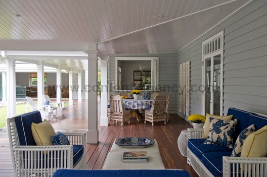
The story shot in Martha's summer house at Seal Harbour, Maine, made me want to be extra nosey and see lots more.

This could be the way magazines are heading and as a magazine girl, I can't wait to make my own magazine stories into Apps. There is so much that goes on behind the scenes on a house shoot it would be great to capture it. I think some of the best moments on a shoot are when I am interviewing the home owner or designer or just walking around their house with them, chatting.


If you haven't got an iPad find a friend who does and download the Martha apps. If you like shelter magazines this is really something to see!